Sunday, October 25, 2009

ASTERIOS POLYP


I sat down to start Asterios Polyp with the intention of reading a few pages then going to bed. Here is what I tweeted half an hour later, "planned on going to sleep 30 minutes ago but Asterios Polyp was too amazing to put down. What a beautiful book and story. Just Wow." Asterios Polyp is reminiscent of many other stories but what makes it different is the way that David Mazzucchelli tells it. Every character has their own word balloon, font and color scheme. They have distinct voices. The narrator is Polyp's unborn identical twin, Ignazio. These are just some of the things that makes the typical "Arrogant Old Man reflects back on his life and realizes he needs to change" story different.

The first sequence of the story begins with no dialogue, only background noises. The color scheme before the lightening is purple, white, and blue. Mazzucchelli is showing us important items that will reoccur in the story as it unfolds - the tapes, Polyp's father's lighter, Hana's curved table, and the kitchen. When the lightening hits we lose the blue in the palette and for the rest of the sequence it's purple, white, and yellow. The yellow gradually takes over as the main color as the fire burns up Polyp's apartment. We are introduced to more important items: Polyp's watch and the Swiss Army knife Hana finds on the beach. We then see all of the spaces we were just introduced to burn in the fire until they are nothing but yellow. The past is being burnt away.

We are then given some basic information about Asterios in a lecture 101 freshman class style voice. And we are introduced to our unique narrator. The idea of having the story told by the unborn brother is genius. He is shadowing his brother's life but he is not alive and can be separate from the story as well. Subjective and objective at the same time.

One of the things that struck me is how each section begins with a picture of an item that will be essential to that section, like a promo for next week's episode. A lot of the narrative sections reminded me of Scott McCloud's "Understanding Comics." The narrator uses images to explain ideas or concepts about Polyp in the same way McCloud does for writing and reading comics.


Color Scheme is extremely important. Pink represents women, not only in a sexual light but also when they become something Polyp cannot understand. When Hana and Asterios have one of their biggest fights the reader is hit emotionally because she turns the color pink. Also the drawing style changes. Besides having different word balloons, Mazzuchelli showed a visual difference in Polyp and Hana's makeups by drawing Hana as curved, scratchy, lines with shading while Polyp is made of geometric shapes. Hana's background story is told almost entirely in pink. To show when their worlds were connected, that they felt connected to each other, Mazzuchelli uses both styles of drawing together and both colors.

One of my favorite scenes of the book is when Asterios blacks out after losing his eye and he has a scene with Ignazio. Over the course of the conversation their word balloons, that are different at first (Polyp's are square and Ignazio's are cloud-like) begin to become one until they are both like Polyp's. It is the moment when he realizes they are the same. Mazzuchelli uses his art not only to create an image but emotion and symbolism. Even the inside covers have meanings. Blue for Polyp for the front inside cover and pink for Hana on the back inside covers.

Sunday, October 18, 2009

CRUMB


I went into this documentary expecting something similar to the Eisner documentary we watched last semester. And although this documentary is powerful and interesting, I think Robert Crumb's role in comics is lost behind the story of him and his family. The first part of the documentary seemed to focus more on Crumb's incredible art style. Some of my favorite parts of the film were just watching Crumb draw people on the street. His ability to create satire as he is watching it is no less than genius.
Once we started diving into his issues with women and some of the comics he created as a result for this, I became more distracted by the ideas on the page than actually viewing them as comics. In a way, I guess it shows that comics can be a medium not only for traditional storytelling and political beliefs but also a therapeutic outlet. Still, in the end I felt this documentary was more about that person and his family than his work. In that way I enjoyed the Eisner documentary more. But as a study of a comic book artist/ writer, Crumb takes the cake.

Tuesday, October 6, 2009

PLANETARY


Planetary is exciting, funny and full of mystery. I thought the set up of the story was like a TV show in that each smaller story was episode but that they are all interconnected. Like Mr. Snow, we are thrown into Planetary's world with not much information but we quickly get caught up in it and want to know where all of this is leading. Like Dr. Brass says on page 22 of Chapter 5, "You want to know everything at once, five seconds after taking your first look at it." And the fact that Planetary gives you just enough to bite into and be hooked makes it genius.

The characters are also interesting, unique, and shrouded in their own questions. All of them seem to be morally ambiguous in subtle ways. There seems to be many untapped layers of each character. Ellis gives you just enough to get a small sense of who Mr. Snow, Jakita, Dr. Brass, and the Drummer are but nothing really substantial, which makes you feel like you are apart of the group. Working with these people, knowing some of their abilities, but not who they really are. My instincts tell me there is much more to Dr. Brass and his story. Not all of the pieces fit. His story was probably my favorite mostly because I like the idea of the snowflake and a group of men in a cave trying to save the world during WWII.

Cassaday's art is flawless. It's sharp, clear and full of emotion. The moments betweent the characters without dialogue work because he is able to convey these emotions through small details and pacing (For example, the third panel of the last page of chapter 40.

All in all, this is a fantastic first issue filled with great ideas, mystery, and characters. I look forward to reading volume two soon!

Monday, September 28, 2009

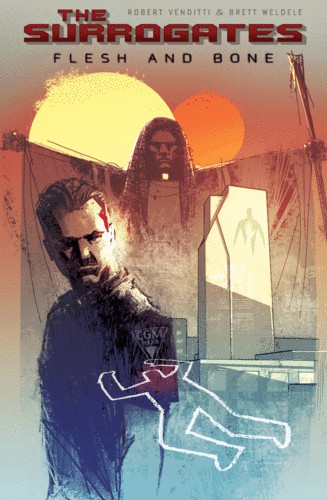
The Surrogates: Flesh and Bone


First off, I should say that this is the first book of The Surrogates series I have read and therefore I might not appreciate it as much as an original fan.
I think my main complaint about this book is the art form. I loved the color palette but I felt that the penciling was rough. However, this might be intentional to contrast the idea of the "perfect," sleek surrogate units. Still, it made differentiating the characters difficult and didn't add an artistic quality to the book. The ballooning was extremely frustrating. I can see that the idea was so have perfect round circles but I hated it when the balloons would unnecessarily cut off the heads of characters and because they weren't outlined it was sometimes difficult to see which character the tail pointed to (see page 26, panel 3 as just one example). Also, I, personally, just don't like when the balloons and gutters seep together. But as I said before, the color palette was pleasing and created a tone and atmosphere for the piece.
The plot wasn't completely original but what what Venditti did well was showing how his vision of 2039 is unique. The back-matter, although sometimes felt a little forced, did create a sense of the world and issues of The Surrogates. I thought some of the most interesting topics that were raised were not just using Surrogates for body image but also to decrease chance of illness (see the questionnaire on pages 93-96). Also, the use of slang (See page 1) helped give the idea of surrogates an authority. The only part of the setting that I think needed some work was that it did not feel like Georgia to me. I am from Georgia but besides the name dropping of familiar locations I didn't know why this story was specifically set in the South.
Overall, I felt like this book is a good read but not groundbreaking.

Sunday, April 26, 2009

Blankets


I was surprised by how much I liked Blankets. I heard it was good but when I looked at the synopsis I thought that it probably wasn't something I'd be into because it wasn't dark, violent, and lacked vampires and batman. But once I started reading "Blankets" I just couldn't put it down. Thompson has created this beautiful tale of first love interwoven with growing up, childhood memories and coming to terms with God. What I love most is how the stylistic art and very real, flesh out characters work. It is almost like we have been swept up into his mind and are reliving the memory with him.
I absolutely love Craig Thompson's art - it has such fluidity and emotion. It really helps with the stories transitions from past to present and thought to reality. For example on page 208, we have past and thought together and then the first panel on page 209 uses these images to bring Craig back to reality.
This is a classic coming of age tale but without the cliches and rolling eyes. Each character is flawed but also beautiful in their own ways (except for the babysitter). I feel like this is a story everyone will like.

Sunday, April 12, 2009

PREACHER


In my opinion, Garth Ennis' "Preacher" is everything a graphic novel should be. When I first picked it up the only thing I could think about was someday I want to have a story and characters as cool as Cassidy, Tulip and Jesse Custer. "Preacher" has humor (dark but funny nonetheless), romance, action, vampires, cowboys, good ol' boys, the Vietnam war, the north, the South, the church, bald one-eyed Germans, genetically distorted Jesus offspring..... It has everything basically. But Ennis was somehow able to weave all of this together and have it make sense.
Now since I am studying villainy, the first thing I focused on was finding it in "Preacher." But what I found is that every single one of the characters is a villain in their own way (This is probably another reason why I like this series so much). Even our heroes, Jesse and Tulip, are no angels. We know by page 24 that Tulip shot the mouth off of a guy. Cassidy's teeth is ripping into a deputy's jugular on page 74. And Jesse's word of God literally gets the sheriff to eff himself on page 117. And these are the heroes! The bad guys, even just the double crossing small guys are taking people's faces off (see page 132). And in Volume two it gets a whole lot darker. I think Ennis does a good job in marking a line between "cool" villains and just plain effed up evil villains. Jesse and Cassidy may do things that would cause a lot of people to call them villains but I don't think anyone would ever like Miss Marie L'Angelle or her boys. After reading Jesse's back story, I felt total sympathy for him and like Tulip, we understand why he left her. Although a lot of characters are introduced, they are all well developed. Even Arseface gets a back story. But it is also clear that like real humans all of these characters have a dark side as well.
The art is great. Not too stylized but still filled with emotion. The covers are fantastic. They are probably my favorite covers since they are provocative (like Y the last man) but also are usually a scene in the story. Fabry is truly talented.

Sunday, April 5, 2009

Y THE LAST MAN (Vol. 1-3)


"Y the Last Man" is Brian K. Vaughan's homage to Mary Shelly's book's "The Last Man." In Shelly's book a plague has killed everyone but a man named Lionel. In Vaughan's tale, a plague has killed all the men (or rather everyone who possesses a Y chromosome) on earth except for a man named Yorick Brown. Another work mentioned that is of note to this comics tutorial is that Yorick's lighter has "Fuck Communism" written on it, which he says is from a graphic novel. That graphic novel is Preacher, which we will be reading next. Jesse Custer, the main character, has the same lighter, which he got from his dad.
But onto the review. I love Y the Last Man. The premise is just so interesting and Vaughan does such a great job setting up this post-plague world. My favorite volume out of the three we read is probably the third. I like the idea of the male astronauts being alive even though they ended up dying once they got to earth. Also, Vaughan does a great job of introducing a lot of characters but not letting any of them fall flat. From Sonia to Natalya, the women Yorick meets all seem very real and unique. Hero, Yorick's sister, is probably the most interesting to me. The whole idea of the Daughters of the Amazon is pretty frightening but seems pretty plausible in that setting. Yorick is my favorite character, though. What I love is that he isn't the usual manly man - but is kind of a self professed dork, who is trying to stay faithful to his girlfriend through this whole ordeal (he fails, but I think we can cut him some slack given the circumstances).
I like that the art is kind of reminiscent of traditional comic book art (Superman is mentioned by Yorick a good bit) and the panels are also pretty traditional, which I thought fit with the radical plot. The cover art is usual realistic but provocative. The third volume in particular, with the skeleton astronaut was pretty gripping.
A very addictive series that always ends on a high note. Favorite line from the series so far: "It's Raining Men. Hallelujah!" in Volume 3, page 87.