Wednesday, December 9, 2009

Cerebus


When I first started reading Cerebus, I though it was going to be like Don Quixote with an aardvark. It was more than a pleasant surprise to see that Cerebus is actually a skilled warrior.

The humor in the book is timeless and hilarious. Even in the early pages, I found myself laughing. Particularly on page 11, when the bartender gives in to serving Cerebus after he threatens him and Cerebus says, "I admire your cowardice, obese one." Because Cerebus' dialogue is over the top and he refers to himself in the third person, I often imagined that it is Cerebus, himself, narrating the story.

Although characters that have such an inflated ego usually annoy me, there is something lovable about Cerebus from the moment he graces the page. You really root for him to succeed.

The art has character but I wish it was in color. With such a humorous script, I wanted lots of color to go with it.

Tuesday, December 8, 2009

Mouseguard


This has been one of my favorite reads of the semester. Petersen has created a vivid world in "Mouseguard" that feels concrete and real. Each mouse has a clear personality and look. We only see Conrad for a few pages, but I was deeply saddened by his death. It is through these characters, each with their own strong beliefs, that carries the story and make a somewhat old plot original and interesting. Saxon stood out to me, in particular. His fearlessness and bravery defies the usual stereotype of a small mouse.

The one mouse that I did want more from was Midnight, the villain. The rest of the mice were so interesting, that he kind of fell flat even though before his reveal he seemed so mysterious.

The art fantastic and perfect for the story. Petersen has not only captured great emotion in the expressions of the mice but his action scenes and scenery is also extremely impressive. The snake fight had me on the edge of my seat. I literally gasped when Lieam was caught in the serpent's mouth.

All in all, Mouseguard is a fun, enjoyable read with lovely characters and beautiful art.

Sunday, December 6, 2009

Charlie Patton


Unlike Yoshihiro Tastumi, who spent 800+ pages writing about a type of art as well as the tale of one person's life, R. Crumb fits a brief history of Jazz and the life of Charlie Patton all into 12 pages. And my main complaint is that this story does feel cramped.
R. Crumb tells this story mostly through narrative, with pictures to go along with the paragraphs. It is an overview, not an in depth day-to-day tale of Patton's life. I, personally, would have wanted a few of the scenes to be more detailed with more dialogue - as if we were living it with Patton. I would have particularly liked to see the scene where his father gives him the guitar, one of the fights with Bertha Lee, and a performance in this style.
Because there is hardly any dialogue and R. Crumb tells the story in such an objective, facts only, style, the reader doesn't really get a real feel for who Charlie Patton is as a person. The images are compelling, especially panel four page six where he is hitting a woman on the head with a guitar (looks violent and sexual at the same time) and the second to last panel on page 12, where you really can see the change in Patton's appearance and the fear he has of being to close to death.
Still, R. Crumb's artistic style and provocative images will keep this story in my mind long after I have finished writing this blog.

A Drifting Life


As a history of manga, A Drifting Life, is concise and more interesting than a text book. But as something to read for pleasure it's about 400 pages too long. I got through the first 100 pages pretty quickly but after that I found myself... well, drifting.
Starting around page 201, with the chapter Road to Success, a pattern sets in that repeats for the rest of the story. The protagonist, Hiroshi, has to make a decision between two avenues to move forward as a manga artist. In Road to Success, it's whether to try for art school or apprentice under Ooshiro Sensei like he promised. He always turns to his brother for advice (pg. 207), then argues with him, but then ultimately comes to a decision. This decision usually leads to some initial success before things start to go wrong and the pattern begins again.
My main complaint about this memoir is that Hiroshi is not very captivating as a main character. He often blends in with the other characters that he works with at Hinomaru. He seems to never make any real mistakes, runs away from confrontation, and only talks about manga as an abstract idea not any in depth details of his own stories.
But what Tatsumi does a great job of is showing the difficulties of being a writer/artist in a professional capacity. Hiroshi's story really shows how hard it is to stay creative and put out your best work on a deadline. How you can be so passionate about something but become distracted so easily (The manga camp in Tokyo is a great example of this).
Tatsumi's art style fits the narration. A Drifting Life reminded me a lot of blankets, not only because they are both memoirs, but because the art style is like a voice itself. It has personality and adds another angle to the character.

Sunday, October 25, 2009

ASTERIOS POLYP


I sat down to start Asterios Polyp with the intention of reading a few pages then going to bed. Here is what I tweeted half an hour later, "planned on going to sleep 30 minutes ago but Asterios Polyp was too amazing to put down. What a beautiful book and story. Just Wow." Asterios Polyp is reminiscent of many other stories but what makes it different is the way that David Mazzucchelli tells it. Every character has their own word balloon, font and color scheme. They have distinct voices. The narrator is Polyp's unborn identical twin, Ignazio. These are just some of the things that makes the typical "Arrogant Old Man reflects back on his life and realizes he needs to change" story different.

The first sequence of the story begins with no dialogue, only background noises. The color scheme before the lightening is purple, white, and blue. Mazzucchelli is showing us important items that will reoccur in the story as it unfolds - the tapes, Polyp's father's lighter, Hana's curved table, and the kitchen. When the lightening hits we lose the blue in the palette and for the rest of the sequence it's purple, white, and yellow. The yellow gradually takes over as the main color as the fire burns up Polyp's apartment. We are introduced to more important items: Polyp's watch and the Swiss Army knife Hana finds on the beach. We then see all of the spaces we were just introduced to burn in the fire until they are nothing but yellow. The past is being burnt away.

We are then given some basic information about Asterios in a lecture 101 freshman class style voice. And we are introduced to our unique narrator. The idea of having the story told by the unborn brother is genius. He is shadowing his brother's life but he is not alive and can be separate from the story as well. Subjective and objective at the same time.

One of the things that struck me is how each section begins with a picture of an item that will be essential to that section, like a promo for next week's episode. A lot of the narrative sections reminded me of Scott McCloud's "Understanding Comics." The narrator uses images to explain ideas or concepts about Polyp in the same way McCloud does for writing and reading comics.


Color Scheme is extremely important. Pink represents women, not only in a sexual light but also when they become something Polyp cannot understand. When Hana and Asterios have one of their biggest fights the reader is hit emotionally because she turns the color pink. Also the drawing style changes. Besides having different word balloons, Mazzuchelli showed a visual difference in Polyp and Hana's makeups by drawing Hana as curved, scratchy, lines with shading while Polyp is made of geometric shapes. Hana's background story is told almost entirely in pink. To show when their worlds were connected, that they felt connected to each other, Mazzuchelli uses both styles of drawing together and both colors.

One of my favorite scenes of the book is when Asterios blacks out after losing his eye and he has a scene with Ignazio. Over the course of the conversation their word balloons, that are different at first (Polyp's are square and Ignazio's are cloud-like) begin to become one until they are both like Polyp's. It is the moment when he realizes they are the same. Mazzuchelli uses his art not only to create an image but emotion and symbolism. Even the inside covers have meanings. Blue for Polyp for the front inside cover and pink for Hana on the back inside covers.

Sunday, October 18, 2009

CRUMB


I went into this documentary expecting something similar to the Eisner documentary we watched last semester. And although this documentary is powerful and interesting, I think Robert Crumb's role in comics is lost behind the story of him and his family. The first part of the documentary seemed to focus more on Crumb's incredible art style. Some of my favorite parts of the film were just watching Crumb draw people on the street. His ability to create satire as he is watching it is no less than genius.
Once we started diving into his issues with women and some of the comics he created as a result for this, I became more distracted by the ideas on the page than actually viewing them as comics. In a way, I guess it shows that comics can be a medium not only for traditional storytelling and political beliefs but also a therapeutic outlet. Still, in the end I felt this documentary was more about that person and his family than his work. In that way I enjoyed the Eisner documentary more. But as a study of a comic book artist/ writer, Crumb takes the cake.

Tuesday, October 6, 2009

PLANETARY


Planetary is exciting, funny and full of mystery. I thought the set up of the story was like a TV show in that each smaller story was episode but that they are all interconnected. Like Mr. Snow, we are thrown into Planetary's world with not much information but we quickly get caught up in it and want to know where all of this is leading. Like Dr. Brass says on page 22 of Chapter 5, "You want to know everything at once, five seconds after taking your first look at it." And the fact that Planetary gives you just enough to bite into and be hooked makes it genius.

The characters are also interesting, unique, and shrouded in their own questions. All of them seem to be morally ambiguous in subtle ways. There seems to be many untapped layers of each character. Ellis gives you just enough to get a small sense of who Mr. Snow, Jakita, Dr. Brass, and the Drummer are but nothing really substantial, which makes you feel like you are apart of the group. Working with these people, knowing some of their abilities, but not who they really are. My instincts tell me there is much more to Dr. Brass and his story. Not all of the pieces fit. His story was probably my favorite mostly because I like the idea of the snowflake and a group of men in a cave trying to save the world during WWII.

Cassaday's art is flawless. It's sharp, clear and full of emotion. The moments betweent the characters without dialogue work because he is able to convey these emotions through small details and pacing (For example, the third panel of the last page of chapter 40.

All in all, this is a fantastic first issue filled with great ideas, mystery, and characters. I look forward to reading volume two soon!

Monday, September 28, 2009

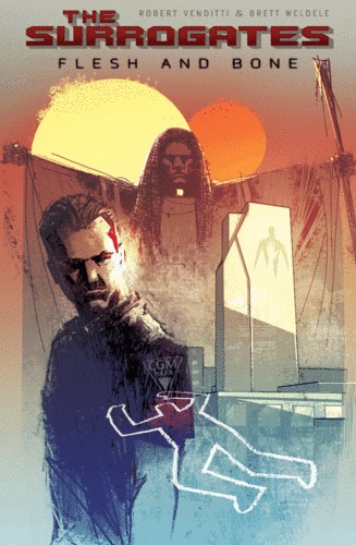
The Surrogates: Flesh and Bone


First off, I should say that this is the first book of The Surrogates series I have read and therefore I might not appreciate it as much as an original fan.
I think my main complaint about this book is the art form. I loved the color palette but I felt that the penciling was rough. However, this might be intentional to contrast the idea of the "perfect," sleek surrogate units. Still, it made differentiating the characters difficult and didn't add an artistic quality to the book. The ballooning was extremely frustrating. I can see that the idea was so have perfect round circles but I hated it when the balloons would unnecessarily cut off the heads of characters and because they weren't outlined it was sometimes difficult to see which character the tail pointed to (see page 26, panel 3 as just one example). Also, I, personally, just don't like when the balloons and gutters seep together. But as I said before, the color palette was pleasing and created a tone and atmosphere for the piece.
The plot wasn't completely original but what what Venditti did well was showing how his vision of 2039 is unique. The back-matter, although sometimes felt a little forced, did create a sense of the world and issues of The Surrogates. I thought some of the most interesting topics that were raised were not just using Surrogates for body image but also to decrease chance of illness (see the questionnaire on pages 93-96). Also, the use of slang (See page 1) helped give the idea of surrogates an authority. The only part of the setting that I think needed some work was that it did not feel like Georgia to me. I am from Georgia but besides the name dropping of familiar locations I didn't know why this story was specifically set in the South.
Overall, I felt like this book is a good read but not groundbreaking.

Sunday, April 26, 2009

Blankets


I was surprised by how much I liked Blankets. I heard it was good but when I looked at the synopsis I thought that it probably wasn't something I'd be into because it wasn't dark, violent, and lacked vampires and batman. But once I started reading "Blankets" I just couldn't put it down. Thompson has created this beautiful tale of first love interwoven with growing up, childhood memories and coming to terms with God. What I love most is how the stylistic art and very real, flesh out characters work. It is almost like we have been swept up into his mind and are reliving the memory with him.
I absolutely love Craig Thompson's art - it has such fluidity and emotion. It really helps with the stories transitions from past to present and thought to reality. For example on page 208, we have past and thought together and then the first panel on page 209 uses these images to bring Craig back to reality.
This is a classic coming of age tale but without the cliches and rolling eyes. Each character is flawed but also beautiful in their own ways (except for the babysitter). I feel like this is a story everyone will like.

Sunday, April 12, 2009

PREACHER


In my opinion, Garth Ennis' "Preacher" is everything a graphic novel should be. When I first picked it up the only thing I could think about was someday I want to have a story and characters as cool as Cassidy, Tulip and Jesse Custer. "Preacher" has humor (dark but funny nonetheless), romance, action, vampires, cowboys, good ol' boys, the Vietnam war, the north, the South, the church, bald one-eyed Germans, genetically distorted Jesus offspring..... It has everything basically. But Ennis was somehow able to weave all of this together and have it make sense.
Now since I am studying villainy, the first thing I focused on was finding it in "Preacher." But what I found is that every single one of the characters is a villain in their own way (This is probably another reason why I like this series so much). Even our heroes, Jesse and Tulip, are no angels. We know by page 24 that Tulip shot the mouth off of a guy. Cassidy's teeth is ripping into a deputy's jugular on page 74. And Jesse's word of God literally gets the sheriff to eff himself on page 117. And these are the heroes! The bad guys, even just the double crossing small guys are taking people's faces off (see page 132). And in Volume two it gets a whole lot darker. I think Ennis does a good job in marking a line between "cool" villains and just plain effed up evil villains. Jesse and Cassidy may do things that would cause a lot of people to call them villains but I don't think anyone would ever like Miss Marie L'Angelle or her boys. After reading Jesse's back story, I felt total sympathy for him and like Tulip, we understand why he left her. Although a lot of characters are introduced, they are all well developed. Even Arseface gets a back story. But it is also clear that like real humans all of these characters have a dark side as well.
The art is great. Not too stylized but still filled with emotion. The covers are fantastic. They are probably my favorite covers since they are provocative (like Y the last man) but also are usually a scene in the story. Fabry is truly talented.

Sunday, April 5, 2009

Y THE LAST MAN (Vol. 1-3)


"Y the Last Man" is Brian K. Vaughan's homage to Mary Shelly's book's "The Last Man." In Shelly's book a plague has killed everyone but a man named Lionel. In Vaughan's tale, a plague has killed all the men (or rather everyone who possesses a Y chromosome) on earth except for a man named Yorick Brown. Another work mentioned that is of note to this comics tutorial is that Yorick's lighter has "Fuck Communism" written on it, which he says is from a graphic novel. That graphic novel is Preacher, which we will be reading next. Jesse Custer, the main character, has the same lighter, which he got from his dad.
But onto the review. I love Y the Last Man. The premise is just so interesting and Vaughan does such a great job setting up this post-plague world. My favorite volume out of the three we read is probably the third. I like the idea of the male astronauts being alive even though they ended up dying once they got to earth. Also, Vaughan does a great job of introducing a lot of characters but not letting any of them fall flat. From Sonia to Natalya, the women Yorick meets all seem very real and unique. Hero, Yorick's sister, is probably the most interesting to me. The whole idea of the Daughters of the Amazon is pretty frightening but seems pretty plausible in that setting. Yorick is my favorite character, though. What I love is that he isn't the usual manly man - but is kind of a self professed dork, who is trying to stay faithful to his girlfriend through this whole ordeal (he fails, but I think we can cut him some slack given the circumstances).
I like that the art is kind of reminiscent of traditional comic book art (Superman is mentioned by Yorick a good bit) and the panels are also pretty traditional, which I thought fit with the radical plot. The cover art is usual realistic but provocative. The third volume in particular, with the skeleton astronaut was pretty gripping.
A very addictive series that always ends on a high note. Favorite line from the series so far: "It's Raining Men. Hallelujah!" in Volume 3, page 87.

Monday, March 23, 2009

The Dark Knight Strikes Again


Wow! What I love most about Frank Miller's "The Dark Knight Strikes Again" is the nostalgic feel of it. The story is a lot to take in but the feel is very prevelant. First thing to note is that I actually liked Catgirl! I am usually not a fan of sidekicks but she was very likable and not so annoying as any of the Robins... Which brings me to my other favorite part of the story: The Dick Grayson as the Joker scenes. The way he was beating up Carrie was very reminiscent of "a Death in the family." I am sad that they real Joker is dead, though. That was my least favorite part of "The Dark Knight Returns." I guess I'm one of those people who think Batman can't exist without the Joker and vice versa.
The whole idea about a holographic president and Lex Luther is awesome. I really loved that part. Having Superman as a slave is really interesting too. As usual Superman is whiny. I did enjoy seeing Bruce kick the crap out of him. Wonder Woman is probably the coolest girl in the story, which is funny cause I normally don't like Wonder Woman very much either. Lara is interesting. I thought that the conversation between her and Superman and what they learn from each other is great.
Miller's characterization of Batman is something I like and question at the same time. I like how dark he is, I think that is perfect. I don't know if he would be SO cruel to Dick Grayson though at the end. But a lot has happened to him so may be. Making another Watchmen reference, Bruce was very much like Rorschach with his "Never compromise" talk and his relentless battle. That's another pair I would love to see have a conversation.
The art is classic Miller but in color - very raw, lots of curves, sometimes it's not clear what is going on. I think it really fit the story. Most Batman stories seem raw to me so I liked it. And no one can draw beat up people just like Miller, ha-ha. The panels were very interesting. For example on page 34, I loved the way the news panels curved around the larger image.

Sunday, March 22, 2009

THE KILLING JOKE


Disclaimer: This is my favorite graphic novel so this will pretty much be all praise.
"The Killing Joke" is the best Joker graphic novel to date in my opinion. Alan Moore takes the usual Joker plot but turns it into something entirely unique. First of all, he goes there all the way with the Joker's twisted cruelty - no silly pranks here but a bullet straight in the gut (in Barbara's case). But on the flip side of this, there is also a real sense of tragedy not usually present in Joker stories. The last panel on page 8 is a perfect example of this. The flash back has just ended with the Joker reaching out to his wife Jeanie, and in this panel, the present, he is reaching out to a clown - incredible foreshadowing. Above the clown it says "Laughing Clown" but in the reflection we see that the Joker is not wearing his trademark smile. His expression is sullen and almost lost. The transitions between the flashbacks and present are great. Most of them have the same poses. The one I like in particular is on pages 23 and 24. In the flash back, the Joker has his hands covering his downturned face in despair and in the present it's Gordon in the same position. This goes along with the Joker's theme that it only takes one bad day to make you crazy - like him.
"The Killing Joker" is fantastic artwise as well. Bolland's rendition of the Joker is probably my favorite along with Alex Roth's. Even though the book is short there are so many panels that the reader feels like a lot is going on. The first panel and the last panel are of the same thing - rain hitting a puddle. This goes along with Batman's monologue. I chose the picture above because it's one of my favorite panels. The desperation and sadness on the Joker's face is so moving. It has always stood out to me.
Since my last entry was about Watchmen, I can't help but see how similar the Joker and the Comedian are in that they both believe that "It's all a joke." And yet they are quite different. Blake worked for the government, seemed to genuinely have feelings for Sally, and cracked when he found out about Veidt's plan. The Joker works for no one but himself, cares about no one, and wouldn't give a damn about 15 million people dying. Still they are an interesting pair. I wonder what a conversation would be like between those two!

Monday, March 9, 2009

WATCHMEN - The Movie


I don't care what Rotten Tomatoes says, I think this movie was great! Of course it doesn't have everything the graphic novel has... it has to be condensed into a 3 hour feature - it can't have everything! For what it was trying to achieve, I think Snyder did a wonderful job. I've seen it twice now. I don't know why the reviews keep saying it's boring! I thought it was a roller coaster beginning to end. The first scene with the Comedian is incredible and the opening credits gave me chills.
The sets were fantastic! It was almost eerie how they had every single little detail there. I payed most attention to Blake's apartment - his pictures of Sally (the poster on the wall and the photo in his bedroom), the one of Laurie in the secret room with his costume, and even the hustler magazine on the table. I feel like that is where you can get a real sense of his inner character - how lonely he is and how he realized he messed up. Jeffrey Dean Morgan was great. He and Jackie Earle Haley, who played Rorschach, definitely had the best performances. Most say Matthew Goode did the worst job in his role as Veidt. I really didn't think he was that bad! I think the fact that they cut a lot of Veidt's scenes that are in the novel from the movie made him a hard character to relate to. The accent was a risk Goode took as an actor and I don't know if he should have... but I did like the sound of his voice - very creepy. I don't know, he didn't bother me and I thought he did convey Veidt as well as he could. Billy Crudup was awesome as Dr. Manhattan. Talk about a hard character to play! Patrick Wilson made Nite Owl less whiny. I liked him in the movie more than the book actually. I'm kind of with Rorschach in his assessment of Dan as a flabby failure who cries in his basement. But I liked how Patrick Wilson played him. Malin Akerman looked perfect for the part. She just needed some voice counseling. All of her lines were delivered in the same way. But at least Laurie was less whiny, as well, in the movie. Carla Gugino was amazing as Sally Jupiter. I loved the scene at the end when she hits Dan's ass. Hilarious.
There wasn't *too* much slow motion either, which is good. The film is definitely visually stunning. I thought that the violence was appropriate. The sex scene, although funny, is really too long. The confrontation scene with Adrian could also have been done a little more smoothly, I think. I did like the ending though. It worked well and it still had the audience asking the same moral questions. One thing I did notice in this ending, though, is that Veidt Industries takes over like all of New York with construction and such and all I could think about was Adrian Veidt is making so much money over this. I hadn't thought about that in the novel and I wondered if being money hungry was also apart of Veidt's plan.
Now, the music. I know a lot of people found it annoying. I am once again in the opposite camp. I thought it was great. I know it made it more "comic booky" and people are not used to music making an editorial comment in movies but I thought it was funny and smart, adding to the atmosphere.
Finally, I guess my favorite scene of the movie would actually have to be the beginning with the Comedian and the opening credits. Not that the movie went downhill from there, it's just tha the opening credits were great and well as I have said, the Comedian is my favorite character. Great movie! I'll definitely be seeing it again.

All Star Superman


This is the first Superman comic I have read in a long time. I've always been more of a Batman fan because Superman is, well, just too good. However, I must say that I did enjoy All Star Superman and am excited to read volume 2. I think this is because it's written by Grant Morrison, who's characters tend to never be goody two shoes. I loved the whole idea that Superman is being killed by his own power and that it was, of course, Lex Luthor who orchestrated everything.
My favorite scene was the prison scene. I love how Lex, who looks a lot like Grant Morrison, is going on and on about how great he is and how Superman must be stopped and Clark Kent/Superman is saving him while Lex is not looking. Then, on page 126, Lex says Kent is everything Superman is not. The eye brow scene on page 127 was priceless. However, I think it's scenes like these that are the reason why I never really got into Superman. They are funny but the belittling of the villain makes them seem less important or should not be taken seriously by the reader. Lex should be taken seriously, of course, but when he is presented this way I just don't think he is as cool or as dangerous as, oh let's say, the Joker.
The art was awesome. Everything I expected of Quitely, after reading WE3, was there. The panels were more traditional but I think that is appropriate for a Superman comic. My favorite page would probably be the full page drawing of Superman and Lois Lane kissing with Earth over head in the background on page 78.
A very interesting story. I wish I knew more about Superman so that I could get into more. Also I wish I was more interested in science because I think that could help here as well.

Sunday, March 1, 2009

Akira - Volume 1


Addicting, addicting, addicting! I have already ordered the second volume of Akira on Amazon. Akira is action packed from the very start. The very first page tells the reader right off that a bomb exploded on Japan and the second and third page is a full picture of the explosion. By doing this, Otomo has gotten our attention immediately and we are drawn into the story from the get go.
I found that the panel perspectives give a very cinematic feel to the piece. For example on pages, 318 - 336, when Kaneda and Tetsuo meet up again I felt as though the camera was going back and forth between the two boys. This is achieved through subject to subject transitions and by having lots of different angles of the same scene.
I have to say I liked all of the characters in the story so far. Kaneda is a brat but in that charming way and Kei is cool, dangerous but feminine. And because I seem to always love the villain, I already have a soft spot for Tetsuo. With the spiky hair and a drug problem, I was constantly reminded of Sid Vicious. He also reminded me of Vegeta in DBZ, in his jealousy and competition with the main character. He is a great villain because like Kaneda the reader knows that he didn't used to be like this (Although we can see on page 24 when Tetsuo says, "This time you follow me, Kaneda!" that his jealousy of Kaneda has always been present) and that this, in a way, was brought upon him. We pity him to an extent. I feel that he will eventually lose his humanity completely but I haven't read the whole series yet so I could be wrong.
A great read. It didn't take long at all to get through the 359 pages with all that action! The story is very interesting too - a world after WWIII. I wonder how Akira will be different from the other number children. The nursery was another one of my favorite parts. Creepy and sad at the same time. Truly a masterpiece!

Sunday, February 22, 2009

WE3


From the cover I really had no idea what to expect from WE3 by Grant Morrison and Frank Quitely. To be honest, it looked this story was going to be happy one - with little animals dressed up in easter egg like costumes. But since it was by Morrison I knew that couldn't be the case and of course it wasn't, ha-ha. Although very short, WE3 makes quite an impression. The art and innovative of use of panels and the actual story itself stuck in my mind long after I put the book down.
My favorite page of the book is the 6th and 7th pages, which is one picture of bullets tearing up a man. Although just one picture the way that the bullets are drawn makes the reader believe that they are moving in mid air. it is a head on perspective. On the 6th and 7th page of the second chapter, carnage is represented by many small panels, some of top of each other, over two larger images. This is a fantastic way of showing many things happening at once. Another aspect of perspective that I loved was that for most of the shots of humans when the animals are in the scene are from below and we don't see much of their face as if we are looking at them through the animals eyes.
Focusing on villainy for this story was also interesting since the real villains of the story, the government, created these animal weapons to destroy enemies/villains and then when the animals escape the government deems the animals enemies/villains. But it is the government who took these household pets and turned them into weapons and even kill one of the Doctors they hired in the process of trying to get the animals back. Their own selfish cruelty turns on them.
All in all, this is a great little graphic novel that made me feel much sympathy and remorse for the animals. It is quite powerful.

Saturday, February 21, 2009

Sunday, February 8, 2009

WATCHMEN

Fan-Freaking-Tastic. That is the only proper way I can start a post on Watchmen. I loved this graphic novel from beginning to end. It has everything - amazing story, well developed characters, twists and turns, humor, interesting and innovative panel perspectives, everything! My favorite aspect of Watchmen is that every detail matters, which is obvious from the very beginning when the focus is a close up of something very small - the Comedian's Smiley Face pin - and then zooms out. This happens through out the entire story. The little details are actually huge and crucial to the overall story. For this post I am going to focus on panel perspectives, the cover, and my favorite character, The Comedian.

I think the best example of how innovative and different the panel perspectives in watchmen are on pages 11 and 18 of Chapter five - where we are literally looking through Rorschach's eyes. This is a whole new level of first person narrative! Even though Watchmen has been called "the unfilmable graphic novel" the panels are very cinematic to me. On page 21 of Chapter 3, the first three panels are different angles/closeups of the Dr. Manhattan. This zooming in and out between panels reminded me very much of a camera. The Dr. Manhattan scenes were always very intriguing. By going back and forth between the present and memories you could almost see as Jon does. It was like being inside the character's minds and following their thought process through images. This is hard to do with words much less panels! But somehow Moore and Gibbons were able to do it very successfully.

The Cover itself is like a panel that connects to the entire first two pages of the story. Each panels moves further and further back from the Comedian's smiley face until we are just over the detective's head. Therefore the graphic novel actually begins before you even open the book!

Although Watchmen is full of interesting characters, I found myself most drawn to the Comedian - who is dead before the story begins. I could really sympathize with Sally because as much as I should hate him I liked him the most. Now this might be because I find characters with questionable morality the most fascinating but then I probably should like Adrian Veidt the most! But the reason why I liked Edward Blake is the same reason why most of the other characters admired him - he understood society and accepted it as a big joke. Whenever he did something "bad" such as assaulting Sally I would feel disappointed in him but not angry. The fact that I was trying to make excuses for a fictional person shows how well Moore created his characters. The end of the novel was fantastic because since the assistant was wearing a shirt with the smiley face while discovering Rorschach's journal it was like the Comedian got the last laugh - like he always said he would.

I'm very excited for the movie. I think the most interesting parts will be how they show Laurie realizing that her father is Blake and if they are able to show how all of the small details tie into the big picture. I am optimistic. I think the casting was great - especially Jeffrey Dean Morgan as the Comedian.

New York Comic Con

This past Saturday I headed down to the Jacob Javit's Center to attend New York ComicCon. I had never gone to a comics convention before - only a small Anime convention in Atlanta - so I was pretty blown away by the sheer number of people there and the size of the gallery. It great to just walk around and see hundreds of people get really excited about the things you find interesting. Some of the costumes were very impressive. I saw one girl who looked exactly like Harley Quinn. Not surprisingly the most popular costume was the Joker. I also saw a wonderful Rorschach costume! I think the guy was even 5'6''! I wonder if he had red hair...

My favorite part of the convention was just witnessing how far the industry has come. In last week's class we watched a documentary on Will Eisner and the rise of comics and the graphic novel. Comics basically went from a small office or just a section of the newspaper to something that hundreds of people would gather to celebrate. I also liked the Marvel and DC booths - some of the figures were really stunning. I am obsessed with action figures so I was a sucker for those booths. I also picked up one of the first Two-Face comics from the 40's. Two Face is my favorite comic book villain so I was pretty psyched.

Since it was my first time going I didn't really know my way around or what I was doing haha hopefully next year I will be able to go the DC Nation panel.

Sunday, February 1, 2009

McCloud Vocab

Some Vocabulary from Scott McCloud's Understanding Comics:

Comics: Basically the entire book is a definition but the easy, straight forward definition is "sequential art" (pg. 5). It is stringing individual pictures together to create a story.

Icon: "Any image used to represent a person, place, thing or idea" (pg 27).

Gutter: "The blank space between the panels" (pg. 66). The space where our brains imagines the actions that occur between the two panels. McCloud has categorized the different types (pgs. 70 - 72):
1. Moment to Moment
2. Action to Action
3. Subject to Subject
4. Scene to Scene
5. Aspect to Aspect
6. Non-Sequitur

Panel: Can show time and can also be an icon itself (pg. 98).

Subjective Motion: "Operates on the assumption that if observing a moving object can be involving, being that object should be more so" (pg. 114). Focuses on the object in motion.

Visual Symbols: For example, McCloud uses the sweat bead on pg. 130. This tells us that the character is probably nervous. These symbols begin a "Visual vocabulary" (pg. 131) for emotions.

The Spirit by Will Eisner


Background Info on Eisner:
-1917 - 2005
-Creator of the Spirit, Lady Luck, John Law and more
- Born in Brooklyn
-Classmates with Bob Kane, creator of Batman
- Drafted in 1942 and returned 1945
-Died in Florida
*Information courtesy of Will Eisner's official website and Wikipedia.

"The Origin of the Spirit" by Will Eisner, June 2nd 1940
Although the story is pretty straightforward, the style of "The Spirit" was definitely innovative in 1940. Eisner uses a lot of shadows to show depth and give off a Sherlock Holmes type atmosphere (Page 5 has great examples of this). He also doesn't stick strictly to keeping his work inside the panels. For example, on the second page, Dr. Cobra's head completely stands alone. On the same page at the bottom, Eisner has created a round panel to show the vat breaking. This allows him to show more of the story on one page and, in my opinion, give the story a cooler look. To show motion, Einser uses lines like Scott McCloud describes in his book (Pg. 110). A great example of this is the 5th panel on page 4 where the coroner is motioning that Dolan has gone a little crazy since Denny Colt died. I really like how he describes the actions in the boxes along with showing the reader in the pictures - so that you are reading and seeing at the same time.
I personally prefer darker stories but this probably was pretty dark for 1940! It is a great way to start a series, though, with all the necessary information jam packed nicely into just 7 pages!

"Lorelei Rox" by Will Eisner, September 19th 1948
Eisner sticks to the same methods above but his use of shadows has increased as you can see from the first scene in Dolan's office. My favorite part of this comic is page 4 where Lorelei is singing and to show that the Spirit is becoming lost in the sound the panel lines have disappeared. Eisner has some very innovative visual perspectives in this story as well. For example, on page 4, the third panel is the Spirit's reflection in the car's side mirror. He doesn't just have three panels of the Spirit driving a truck - this makes the story much more exciting.

Covers
The first thing I noticed about the seven sample covers we were given in the last class was that in four of them the Spirit is in some sort of struggle. Another reoccurring feature is the use of words in the artwork - usually to give a brief summary of the story. All are highly detailed and take up the entire page. My personal favorite is No. 28, where this small pygmy like monsters are attacking the Spirit in the sewers. I love the emotion on the spirits face and the viciousness of the creatures (especially the one attack his leg!).

Sunday, January 25, 2009

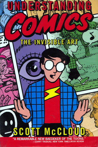
Scott McCloud's Understanding Comics


Normally I find books that discuss mediums quite boring, however Scott McCloud's Understanding Comics was not only interesting but enjoyable. The genius of the book is that he is showing and telling the reader his ideas at the same time, which in fact he says is one of the most amazing things about comics. Because I had the text and the visual it was almost like having a class lecture on comics right in my apartment. I liked how he not only talked about the history of comics but also tackled big universal questions like are comics art. His side notes were also helped to convey his idea and were always a good laugh. On the whole I find the book is very effective in its message.

The chapters of the book I found most interesting were Chapters 3, 5 and 6. Chapter 3 was probably the most interesting chapter to me though because I had never really thought about the spaces between panels that much. In fact, it's key in telling a story. The way McCloud categorized the different transitions between frames and also the six steps involved in creating comics made broad, intimidating ideas easier to handle. I liked Chapter 5 because as an artist I do agree that all lines convey some sort of emotion or message and using lines as a story telling tool is essential in comics. The brief history lesson of comics in Chapter six and through out the book was also very interesting to me.

This book is not only useful as a reader but as someone who does want to create her own comics I felt that this book was very helpful.